Descriptive statistics
| Site: | learnonline |
| Course: | Research Methodologies and Statistics |
| Book: | Descriptive statistics |
| Printed by: | Guest user |
| Date: | Sunday, 7 June 2026, 11:09 AM |
Description
Introduction Health professionals are confronted with statistics on a daily basis. Examples include interpreting clinical values measured on a patient, understanding clinical guidelines or departmental reports, and importantly, reading scientific papers in order to assess the evidence for treatment. Having an understanding of statistics will empower health professionals and provide them with key tools in both understanding and applying evidence in their practice. Topic Objectives On completion of this topic students should be able to: Descriptive vs Inferential statistics Whenever we collect health information, it is invariably on a sample. Apart from a national census, it is usually impossible to collect information on everyone in the population, for either logistical or cost reasons. When we describe our sample in terms of for example, average age, or percentage female, we are undertaking descriptive statistics. When we draw conclusions about the whole population based on our sample data, it is called inferential statistics, because we are making inferences about the population based only on sample data. Types of quantitative data When undertaking any statistical analysis, the type of statistics calculated or statistical test undertaken depends to a large extent on the type of variable being analysed. In this section you will learn about continuous, categorical and nominal variables. A variable is by definition, something that you measure that is able to vary. For example, height, weight and gender are variables. In contrast, a constant is something that always keeps the same value. Examples include pi (approximately 3.142) and e (approximately 2.718). Variables can broadly be divided into two types, categorical and numerical. Categorical variables can be dichotomous (also called binary), nominal or ordinal. Nominal variables (from Latin for name) are things like eye colour or hair colour. We might have: 1=blue eyes, 2=brown eyes, 3=green eyes. However, we might equally have: 1=brown eyes, 2=green eyes, 3=blue eyes. In other words, is the label that is important, not the number attached to it. When we describe nominal variables or dichotomous variables, we simply count the number and percentage in each category. It would make no sense to for example, ask what the average eye colour is! Dichotomous variables are nominal variables that can only take on two values, for example males and females. They are often coded 0 or 1, for example 0=males, 1=females. Dichotomous variables can either be true dichotomous variables like dead or alive, or they can be continuous, nominal or ordinal variables divided into two categories. Ordinal variables have categories in which only the ordering counts. For example, we might have 0=no disease, 1=mild disease, 2=severe disease. There is a clear order here. However the distance between no disease and mild disease, might not be the same as the distance between mild disease and severe disease – only the ordering is important. Numerical data can be counts or continuous variables. Counts are whole numbers starting from zero. Typical variables that are counts are cells on an agar plate, falls in a hospital, or the number of people with a particular disease. Continuous variables are things like blood pressure, height and body temperature. They can take on any number between their minimum and maximum value. Continuous variables are sometimes divided into interval variables and ratio variables. In an interval variable the distance between readings is interpreted the same no matter where you are on the continuum. For example, the distance between 3kg and 5kg, is the same as the distance between 7kg and 9kg. Ratio variables are interval variables where zero means the absence of something. For example, height is a ratio variable. On the other hand, temperature in degrees centigrade is not a ratio variable, since zero degrees does not mean the absence of temperature. Since interval and ratio variables are in most cases described and analysed in the same way, from here on, we will simply call them continuous variables. Test yourself Population size is: a) a nominal variable b) a ratio variable c) a count variable d) an ordinal variable Population size order is: a) an interval variable b) a continuous variable c) a count variable d) an ordinal variable Ethnicity is: a) a nominal variable b) a continuous variable c) a dichotomous variable d) an ordinal variable Age in years is: The rating of degree of difficulty is: a) a nominal variable b) a continuous variable c) a dichotomous variable d) an ordinal variable Describing continuous variables When collecting data, we end up with jumble of numbers which somehow we need to make sense of. Our first task is usually to summarise the data. For example, what is a typical value? What is the smallest and largest value? Descriptive statistics refers to this task of summarising a set of data. One of the easiest ways of starting to understand the collected data is to create a frequency table. For example, the data below are the weights of 50 students in kilograms. Table 1: Weight of 50 students 37 63 56 54 39 49 55 114 59 55 54 30 107 38 51 31 19 95 87 82 65 38 110 57 64 105 58 55 85 35 64 96 43 56 41 55 50 99 105 28 63 76 65 77 68 55 89 66 66 74 Just looking at the numbers doesn’t really help us decide, for example, what a typical student weighs. Let us know create a frequency table in which we break weight into 10kg categories, and count how many students fall into each category. The table below was created using the Stata tab command. The Freq. column is the simple count of how many students are in each weight group. The count describes the shape of the variable, and the table is often called the frequency distribution of the variable. In most health data, the shape of the distribution typically has the highest frequency in the middle, getting smaller as you get further away from the most common values. More of this later. The Percent column is the count as a percentage of the total. The cumulative percent column as its name implies, simply sums up the percentages. Now simply looking at the table we can say that the most common weight group, or weight group with the highest frequency is 50-59 kg, and 76% of all students in our sample weigh less than 80 kilograms. Table 2: Frequency histogram of student weights The cumulative percent column as its name implies, simply sums up the percentages. Now simply looking at the table we can say that the most common weight group is 50-59 kg, and 76% of all students in our sample weigh less than 80 kilograms. We can also turn the table into a chart called a histogram. Figure 2 shows a frequency histogram of the above data. Figure 2: Histogram of the weight of 50 students Measures of Central Tendency This is really a fancy name for asking what a typical value of the variable is. For example, what is a typical weight of the students? In common language, we call a measure of central tendency an average. However, in statistics there is more than one measure of central tendency or average. The most commonly used ones are the arithmetic mean (often just called the mean) and the median. You may occasionally come across the mode, which is the most common frequency - for example, in the student weights data set, the mode was 50-59 kg. However, because the mode is very difficult to handle mathematically, we tend to not use it much. The Mean The mean is the most commonly used measure of central tendency or typical value. It is very easy to handle mathematically, simple to calculate, and usually falls in the middle of the data set. To calculate the mean, we simply add up all of the values and divide by the sample size. For our student weights: In statistics, we often use shorthand to make the formula easier (at least for statisticians) to read. For example, instead of “Sum of values” we use the Greek letter sigma (Σ). Thus you might find the above formula written in a textbook as: where x represents the variable to be summed. Let us now return to the histogram and the shape of distributions. Have a look again at Figure 2. Imagine if you can, instead of having 10 kg categories for weight we had 1 kg categories, and a sample size of 1,000. Now imagine if we had 1 gm categories and a sample size of 100,000. As the category size gets smaller and smaller, and the sample size gets bigger and bigger, the number of bars in Figure 1 would get greater and greater, and the outline would change from a ragged shape to a beautiful smooth curve. Eventually, it might look like the shape you see in Figure 3. This distribution shape is known as the Normal or Gaussian distribution, and is very commonly found in variables related to health. Figure 3: Normal or Gaussian distribution Note that if a variable has a Normal distribution, the mean, median (and mode) all fall in exactly the same place, the centre of the distribution. Variables that tend to have a Normal distribution are those that have lots of inputs going into them. For example, blood pressure can be impacted on by age, weight, obesity, genetics, sex, position of the body etc. However, some variables we measure in health do not have a symmetrical distribution. These are typically variables with only a few inputs. Blood lead levels in children is a good example. The two key factors driving blood levels in children are the child’s age (blood lead peaks at about 12 months) and exposure to a source of lead. Because of this, the distribution of children’s blood lead levels is asymmetrical, or in statistics, we say it is skewed. In the case of blood lead, it is skewed to the right positively skewed. This is because most children have very low levels of blood lead, but some (for example those living near a smelter), have very high levels. When the variable of interest has a skewed distribution, the mean is no longer a good typical value. This is because the extreme values in the long tail drag the mean towards them. This happens because of the way the mean is calculated. Instead, we use another measure of central tendency – the median. To obtain the median, we simply sort all our observations in to size order, and take the middle one. This works fine for an odd number of observations. For an even number of observations, we take midpoint between the two middle ones. Let’s have a look at the weight data sorted into size order, and provided in Table 3. Table 3: Weight of students sorted by size 19 43 55 65 87 28 49 56 65 89 30 50 56 66 95 31 51 57 66 96 35 54 58 68 99 37 54 59 74 105 38 55 63 76 105 38 55 63 77 107 39 55 64 82 110 41 55 64 85 114 Since there are 50 observations, the median lies midway between the 25th and 26th observation, that is halfway between 58 and 59, so the median is 58.5. To demonstrate a skewed distribution and its impact on the mean, I have taken the weight of the students, and deliberately changed some of the higher values to lower values. Figure 4 shows the result. Figure 4: Example of a skewed distribution The distribution is clearly skewed with a long right hand tail, i.e., it is positively skewed. For the above data, the mean is 52.9 kg, whereas the median is 43.0 kg, clearly demonstrating that the mean is no longer a typical value for this dataset. Test yourself All people aged 70 or over in Broken Hill complete a survey measuring their physical and mental health. The mental health scale ranges from 1 to 100, where 1 represents someone with extremely poor mental health, and 100, someone with no mental health issues. The mean mental health score is much lower than the median. Discuss the implications of this. Measures of Dispersion As well as knowing what a typical value is for a variable, we also like to know how spread-out the observations are around that typical value. In other words, are they tightly clustered around the mean, or very scattered. In order to measure this, a sensible question might be “what is the average distance of each observation from the mean?” Let’s have a look at an example. Here are some observations: 4 4 6 2 5 3 The mean of the above observations (hopefully you can calculate it in your head) is 4. To get the average distance from the mean, we subtract the mean from each observation, add up these differences, and divide by 6. Let’s have a go: What has happened is that because some observations are greater than the mean, and some less, when you add the differences up, they always come to zero! Hmmm – so not a particularly useful measure of dispersion. To get around this problem, we square the distance of each observation from the mean. The Standard deviation The standard deviation (commonly abbreviated to sd), is the usual measure of dispersion or variability that you will see in published papers. Its formula looks complicated, but the idea is relatively straightforward. The variance is the square of the standard deviation, and we will look at how that is calculated first. In other words, subtract the mean from each observation, square the result to get rid of the minus sign, add up all of these values, and divide by (n – 1). In the above equation, n - 1 is called the degrees of freedom (you will often see the abbreviated to df). We use (n – 1) rather than n because we already know the mean value, and this makes one observation redundant. You are probably scratching your head at this! Suppose I told you that five numbers had a mean of 3. The numbers are: 1 5 4 2 ? Since the mean is 3, the total must be 5 x 3 = 15. Therefore the missing number has to be 3. In other words, if you are given the mean, you only need n -1 observations to calculate the last one. If the original observations were in kilograms, then the variance is in units of kg2. To get it back to the original units, we take the square root of the variance to arrive at the standard deviation. Thus: So when we are describing a set of observations with a Normal distribution shape, we present the mean and standard deviation. For our weights of 50 students shown in Table 1, the mean is 63.7, the variance 541.9 kg2, and the standard deviation 23.4 kg. As an aside, things like the mean, standard deviation, median, and proportion obtained from a sample are called sample statistics. The range and Interquartile range We pointed out earlier, that the mean is not a good typical value for skewed distributions. However the formula for the standard deviation includes the mean. Does this imply that the standard deviation is not valid as a measure of variability for skewed distributions? In short, yes! The median was calculated by first sorting all observations into size order and then taking the middle value. If we sort all observations into size order, then calculate the cumulative percentage for each observation as we go along, the cumulative percentages are known as percentiles. Table 4 shows an example of this process. Table 4: Percentiles of weights of 50 students x Percentile x Percentile x Percentile x Percentile x Percentile 19 2 43 22 55 42 65 62 87 82 28 4 49 24 56 44 65 64 89 84 30 6 50 26 56 46 66 66 95 86 31 8 51 28 57 48 66 68 96 88 35 10 54 30 58 50 68 70 99 90 37 12 54 32 59 52 74 72 105 92 38 14 55 34 63 54 76 74 105 94 38 16 55 36 63 56 77 76 107 96 39 18 55 38 64 58 82 78 110 98 41 20 55 40 64 60 85 80 114 100 In order to describe the spread or variability of the variable when it is skewed we usually use either the range or interquartile range (IQR). The range is the difference between the maximum and minimum value. In the table above, this is 114-19 which equals 95 kg. In fact most researchers report the maximum and minimum values rather than the range. The IQR is the difference between the 25th and 75th percentile. In the above table, this is 76.5-49.5 which is 27 kg. Test yourself 1 When the average family income is reported in the news, do they mean the arithmetic mean or median? 2 When reporting blood lead levels in children, which measures of central tendency and dispersion would you use? Correlation Up until now, we have only considered descriptive statistics for a single variable. However, what if we have two variables and we are interest in whether or not they are associated. In other words, if one variable goes up does the other go up with it? The measure of association we use to demonstrate how to variables are related is called the correlation coefficient – yet another sample statistic. The correlation coefficient (also known as the Pearson correlation coefficient) measures how well two variables are related in a linear (straight line) fashion, and is always called r. r lies between -1 and +1. A value of r = -1 means that the two variables are exactly negatively correlates, i.e., as one variable goes up, the other goes down. A value of r = +1 means that the two variables are exactly positively correlates, i.e., as one variable goes up, the other goes up. A value of r = 0, means that the two variables are not linearly related. Figure 5 shows the association between the heights and weights of 100 military recruits. This type of graph is called a scatter diagram. Figure 5: Scatter diagram of the heights and weights of military recruits There clearly appears to be a straight line trend between height and weight and the association is positive, that is weight increases with height. In fact for the above data, the Pearson correlation coefficient is r = 0.56. Test yourself 1 Can you think of an example where you would expect a negative correlation? 2 From a graph, two variables are clearly highly associated. However, the correlation coefficient is close to zero. Why might this be the case?
Table of contents
- Introduction
- Types of quantitative data
- Describing continuous variables
- Measures of Central Tendency
- Measures of Dispersion
- Correlation
- Non-parametrics
- Transformations
- Non-parametric tests
- Descriptive Analyses
- Correlation
- Comparing two means: One-sample tests
- Comparing two means: Two independent samples tests
- Comparing two means: Two paired samples tests
- Comparing more than two groups
- Self-Assessment: Descriptive Statistics Module
Introduction
![]() Whether you are undertaking qualitative or quantitative research, you will need to describe the characteristics of the population under study. To a large extent, this involves summarising data, as with more than a handful of subjects, it would be too difficult and long-winded to try and describe every individual.
Whether you are undertaking qualitative or quantitative research, you will need to describe the characteristics of the population under study. To a large extent, this involves summarising data, as with more than a handful of subjects, it would be too difficult and long-winded to try and describe every individual.
In this section, we cover the basics of describing the data, focusing in particular on asking what is a typical value, and how spread out the data are.
Types of quantitative data
![]() When undertaking any statistical analysis, the type of statistics calculated or statistical test undertaken depends to a large extent on the type of variable being analysed. In this section you will learn about continuous, categorical and nominal variables.
When undertaking any statistical analysis, the type of statistics calculated or statistical test undertaken depends to a large extent on the type of variable being analysed. In this section you will learn about continuous, categorical and nominal variables.
A variable is by definition, something that you measure that is able to vary. For example, height, weight and gender are variables. In contrast, a constant is something that always keeps the same value. Examples include pi (approximately 3.142) and e (approximately 2.718). Variables can broadly be divided into two types, categorical and numerical.
Categorical variables can be dichotomous (also called binary), nominal or ordinal.
Nominal variables (from Latin for name) are things like eye colour or hair colour. We might have: 1=blue eyes, 2=brown eyes, 3=green eyes. However, we might equally have: 1=brown eyes, 2=green eyes, 3=blue eyes. In other words, is the label that is important, not the number attached to it. When we describe nominal variables or dichotomous variables, we simply count the number and percentage in each category. It would make no sense to for example, ask what the average eye colour is!
Dichotomous variables are nominal variables that can only take on two values, for example males and females. They are often coded 0 or 1, for example 0=males, 1=females. Dichotomous variables can either be true dichotomous variables like dead or alive, or they can be continuous, nominal or ordinal variables divided into two categories.
Ordinal variables have categories in which only the ordering counts. For example, we might have 0=no disease, 1=mild disease, 2=severe disease. There is a clear order here. However the distance between no disease and mild disease, might not be the same as the distance between mild disease and severe disease – only the ordering is important.
Numerical data can be counts or continuous variables.
Counts are whole numbers starting from zero. Typical variables that are counts are cells on an agar plate, falls in a hospital, or the number of people with a particular disease.
Continuous variables are things like blood pressure, height and body temperature. They can take on any number between their minimum and maximum value. Continuous variables are sometimes divided into interval variables and ratio variables.
In an interval variable the distance between readings is interpreted the same no matter where you are on the continuum. For example, the distance between 3kg and 5kg, is the same as the distance between 7kg and 9kg.
Ratio variables are interval variables where zero means the absence of something. For example, height is a ratio variable. On the other hand, temperature in degrees centigrade is not a ratio variable, since zero degrees does not mean the absence of temperature. Since interval and ratio variables are in most cases described and analysed in the same way, from here on, we will simply call them continuous variables.
Describing continuous variables
![]() When collecting data, we end up with jumble of numbers which somehow we need to make sense of. Our first task is usually to summarise the data. For example, what is a typical value? What is the smallest and largest value? Descriptive statistics refers to this task of summarising a set of data.
When collecting data, we end up with jumble of numbers which somehow we need to make sense of. Our first task is usually to summarise the data. For example, what is a typical value? What is the smallest and largest value? Descriptive statistics refers to this task of summarising a set of data.
One of the easiest ways of starting to understand the collected data is to create a frequency table. For example, the data below are the weights of 50 students in kilograms.
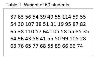
Just looking at the numbers doesn’t really help us decide, for example, what a typical student weighs. Let us now create a frequency table in which we break weight into 10kg categories, and count how many students fall into each category.
The table below was created using the Stata tab command. The Freq. column is the simple count of how many students are in each weight group. The count describes the shape of the variable, and the table is often called the frequency distribution of the variable. In most health data, the shape of the distribution typically has the highest frequency in the middle, getting smaller as you get further away from the most common values. More of this later.
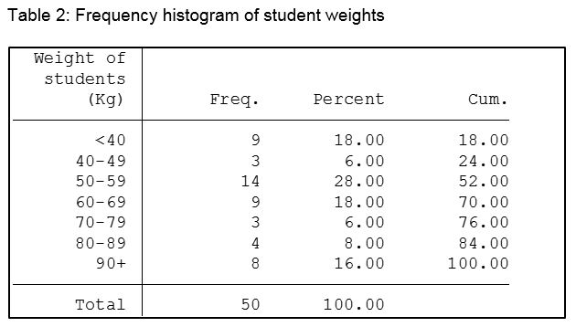
The Percent column is the count as a percentage of the total. The cumulative percent column as its name implies, simply sums up the percentages.
Now simply looking at the table we can say that the most common weight group, or weight group with the highest frequency is 50-59 kg, and 76% of all students in our sample weigh less than 80 kilograms.
The cumulative percent column as its name implies, simply sums up the percentages.
Now simply looking at the table we can say that the most common weight group is 50-59 kg, and 76% of all students in our sample weigh less than 80 kilograms.
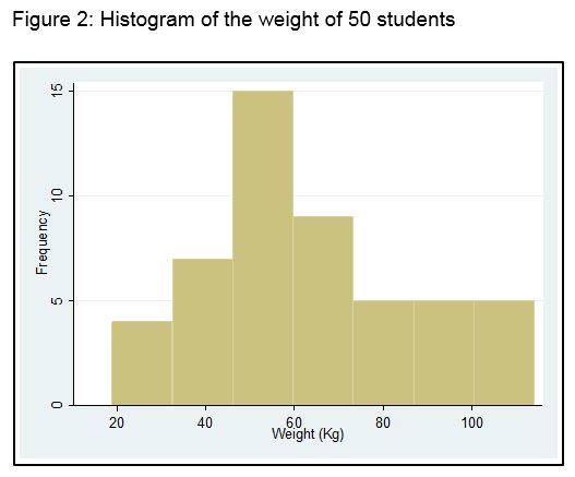
We can also turn the table into a chart called a histogram. Figure 2 shows a frequency histogram of the above data.
Measures of Central Tendency
![]() This is really a fancy name for asking what a typical value of the variable is. For example, what is a typical weight of the students? In common language, we call a measure of central tendency an average. However, in statistics there is more than one measure of central tendency or average. The most commonly used ones are the arithmetic mean (often just called the mean) and the median. You may occasionally come across the mode, which is the most common frequency - for example, in the student weights data set, the mode was 50-59 kg. However, because the mode is very difficult to handle mathematically, we tend to not use it much.
This is really a fancy name for asking what a typical value of the variable is. For example, what is a typical weight of the students? In common language, we call a measure of central tendency an average. However, in statistics there is more than one measure of central tendency or average. The most commonly used ones are the arithmetic mean (often just called the mean) and the median. You may occasionally come across the mode, which is the most common frequency - for example, in the student weights data set, the mode was 50-59 kg. However, because the mode is very difficult to handle mathematically, we tend to not use it much.
The Mean
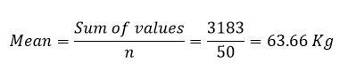
The mean is the most commonly used measure of central tendency or typical value. It is very easy to handle mathematically, simple to calculate, and usually falls in the middle of the data set. To calculate the mean, we simply add up all of the values and divide by the sample size. For our student weights:
In statistics, we often use shorthand to make the formula easier (at least for statisticians) to read. For example, instead of “Sum of values” we use the Greek letter sigma (Σ). Thus you might find the above formula written in a textbook as:
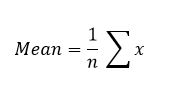
where x represents the variable to be summed.
Let us now return to the histogram and the shape of distributions. Have a look again at Figure 2. Imagine if you can, instead of having 10 kg categories for weight we had 1 kg categories, and a sample size of 1,000. Now imagine if we had 1 gm categories and a sample size of 100,000. As the category size gets smaller and smaller, and the sample size gets bigger and bigger, the number of bars in Figure 1 would get greater and greater, and the outline would change from a ragged shape to a beautiful smooth curve. Eventually, it might look like the shape you see in Figure 3. This distribution shape is known as the Normal or Gaussian distribution, and is very commonly found in variables related to health.
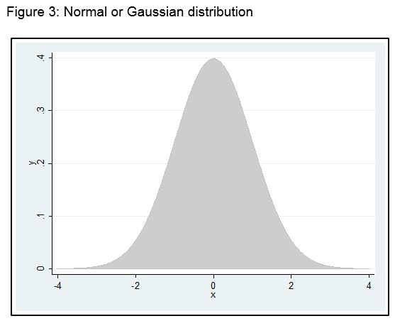
Note that if a variable has a Normal distribution, the mean, median (and mode) all fall in exactly the same place, the centre of the distribution. Variables that tend to have a Normal distribution are those that have lots of inputs going into them. For example, blood pressure can be impacted on by age, weight, obesity, genetics, sex, position of the body etc.
The Median
However, some variables we measure in health do not have a symmetrical distribution. These are typically variables with only a few inputs. Blood lead levels in children is a good example. The two key factors driving blood levels in children are the child’s age (blood lead peaks at about 12 months) and exposure to a source of lead. Because of this, the distribution of children’s blood lead levels is asymmetrical, or in statistics, we say it is skewed. In the case of blood lead, it is skewed to the right positively skewed. This is because most children have very low levels of blood lead, but some (for example those living near a smelter), have very high levels.
When the variable of interest has a skewed distribution, the mean is no longer a good typical value. This is because the extreme values in the long tail drag the mean towards them. This happens because of the way the mean is calculated. Instead, we use another measure of central tendency – the median. To obtain the median, we simply sort all our observations in to size order, and take the middle one. This works fine for an odd number of observations. For an even number of observations, we take midpoint between the two middle ones. Let’s have a look at the weight data sorted into size order, and provided in Table 3.
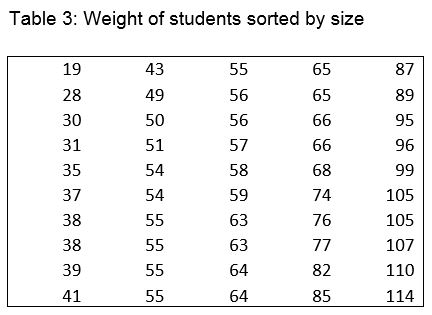
Since there are 50 observations, the median lies midway between the 25th and 26th observation, that is halfway between 58 and 59, so the median is 58.5.
To demonstrate a skewed distribution and its impact on the mean, I have taken the weight of the students, and deliberately changed some of the higher values to lower values. Figure 4 shows the result.
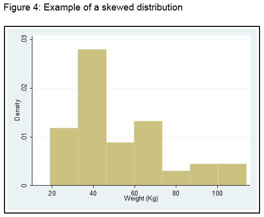
The distribution is clearly skewed with a long right hand tail, i.e., it is positively skewed. For the above data, the mean is 52.9 kg, whereas the median is 43.0 kg, clearly demonstrating that the mean is no longer a typical value for this dataset.
Measures of Dispersion
![]() As well as knowing what a typical value is for a variable, we also like to know how spread-out the observations are around that typical value. In other words, are they tightly clustered around the mean, or very scattered. In order to measure this, a sensible question might be “what is the average distance of each observation from the mean?” Let’s have a look at an example. Here are some observations:
As well as knowing what a typical value is for a variable, we also like to know how spread-out the observations are around that typical value. In other words, are they tightly clustered around the mean, or very scattered. In order to measure this, a sensible question might be “what is the average distance of each observation from the mean?” Let’s have a look at an example. Here are some observations:
4 4 6 2 5 3
The mean of the above observations (hopefully you can calculate it in your head) is 4. To get the average distance from the mean, we subtract the mean from each observation, add up these differences, and divide by 6. Let’s have a go:
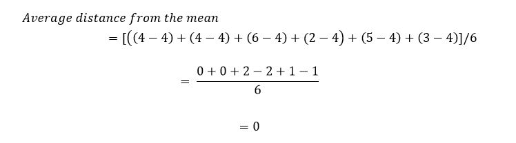
What has happened is that because some observations are greater than the mean, and some less, when you add the differences up, they always come to zero! Hmmm – so not a particularly useful measure of dispersion. To get around this problem, we square the distance of each observation from the mean.
The Standard Deviation
The standard deviation (commonly abbreviated to sd), is the usual measure of dispersion or variability that you will see in published papers. Its formula looks complicated, but the idea is relatively straightforward. The variance is the square of the standard deviation, and we will look at how that is calculated first:
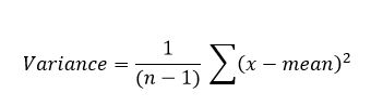
In other words, subtract the mean from each observation, square the result to get rid of the minus sign, add up all of these values, and divide by (n – 1). In the above equation, n - 1 is called the degrees of freedom (you will often see the abbreviated to df). We use (n – 1) rather than n because we already know the mean value, and this makes one observation redundant. You are probably scratching your head at this!
Suppose I told you that five numbers had a mean of 3. The numbers are:
1 5 4 2 ?
Since the mean is 3, the total must be 5 x 3 = 15. Therefore the missing number has to be 3. In other words, if you are given the mean, you only need n -1 observations to calculate the last one.
If the original observations were in kilograms, then the variance is in units of kg2. To get it back to the original units, we take the square root of the variance to arrive at the standard deviation. Thus:
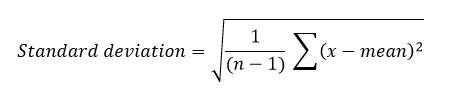
So when we are describing a set of observations with a Normal distribution shape, we present the mean and standard deviation. For our weights of 50 students shown in Table 1, the mean is 63.7, the variance 541.9 kg2, and the standard deviation 23.4 kg. As an aside, things like the mean, standard deviation, median, and proportion obtained from a sample are called sample statistics.
The range and Interquartile range
We pointed out earlier, that the mean is not a good typical value for skewed distributions. However the formula for the standard deviation includes the mean. Does this imply that the standard deviation is not valid as a measure of variability for skewed distributions? In short, yes!
The median was calculated by first sorting all observations into size order and then taking the middle value. If we sort all observations into size order, then calculate the cumulative percentage for each observation as we go along, the cumulative percentages are known as percentiles. Table 4 shows an example of this process.
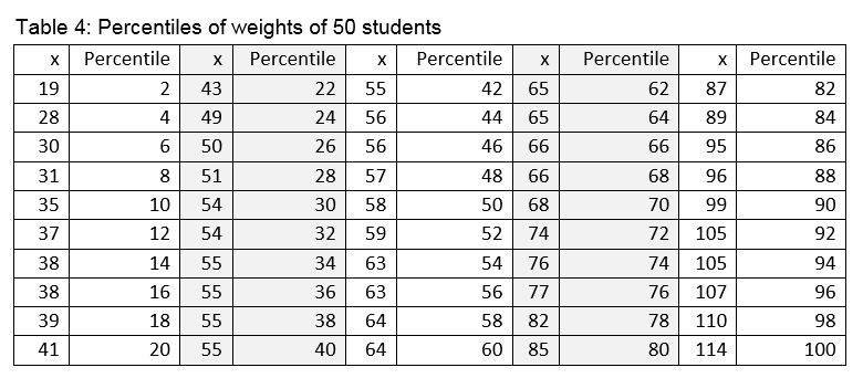
In order to describe the spread or variability of the variable when it is skewed we usually use either the range or interquartile range (IQR). The range is the difference between the maximum and minimum value. In the table above, this is 114-19 which equals 95 kg. In fact most researchers report the maximum and minimum values rather than the range. The IQR is the difference between the 25th and 75th percentile. In the above table, this is 76.5-49.5 which is 27 kg.
Correlation
![]() Up until now, we have only considered descriptive statistics for a single variable. However, what if we have two variables and we are interest in whether or not they are associated. In other words, if one variable goes up does the other go up with it? The measure of association we use to demonstrate how to variables are related is called the correlation coefficient – yet another sample statistic.
Up until now, we have only considered descriptive statistics for a single variable. However, what if we have two variables and we are interest in whether or not they are associated. In other words, if one variable goes up does the other go up with it? The measure of association we use to demonstrate how to variables are related is called the correlation coefficient – yet another sample statistic.
The correlation coefficient (also known as the Pearson correlation coefficient) measures how well two variables are related in a linear (straight line) fashion, and is always called r. r lies between -1 and +1. A value of r = -1 means that the two variables are exactly negatively correlates, i.e., as one variable goes up, the other goes down. A value of r = +1 means that the two variables are exactly positively correlates, i.e., as one variable goes up, the other goes up. A value of r = 0, means that the two variables are not linearly related.
Figure 5 shows the association between the heights and weights of 100 military recruits. This type of graph is called a scatter diagram.
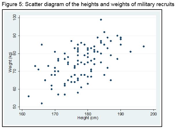
There clearly appears to be a straight line trend between height and weight and the association is positive, that is weight increases with height. In fact for the above data, the Pearson correlation coefficient is r = 0.56.
Non-parametrics
Introduction
In this module, Stata will mainly be used to demonstrate the various procedures. However, nearly all main statistical packages, such as SPSS and SAS can undertake the same analyses. Many statistical tests make the assumption
that the variable of interest, or dependent variable, has a normal (bell-shaped) distribution. How can we tell if the variable is normally distributed? The data below are the SF-36 physical health scores for 205 military recruits. The SF-36 scales range from 0 (poorest quality of life) to 1 (best quality of life).

The distribution clearly looks skewed with a long left-hand detail. This is quite typical of quality of life measures, where the majority of people have a good quality of life.
We can have a quick look at the shape of the distribution, by creating a histogram. We do this in Stata using the histogram procedure.
hist phy_b

This quite clearly shows the long left-hand tail.
We can also get a smoother quick look at the distribution, using the Stata kdensity command.
kdensity phy_b

The long left-hand tail is even clearer.
A final quick check on the shape of the distribution, is by undertaking a box plot. We use the graph box procedure in Stata to do this.
graph box phy_b

In the box plot, the centre line is the median. For a normal distribution, it should be in the centre of the shaded area. The two horizontal lines at the edge of the shaded area represent the 25th and 75th percentile. The two extreme horizontal lines are called the lower and upper adjacent values. They are 1.5 iqr (interquartile range) away from the 25th and 75th percentiles. Finally, the dots represent outliers.
Test of symmetry
The normal distribution is symmetrical about the mean, so the first thing we can do is check to see if our distribution is symmetrical. This is easily done in Stata using the symplot procedure.
symplot phy_b

A symmetry plot graphs the distance above the median for the i-th value against the distance below the median for the i-th value. A variable that is symmetric would have points that lie on the diagonal line. Clearly, this is not the case for our data.
Normal quantile plot
A normal quantile plot graphs the quantiles of a variable against the quantiles of a normal distribution. We ask for it using the Stata qnorm procedure.
qnorm phy_b

qnorm is sensitive to non-normality near the tails, and we see considerable deviations from the diagonal line in the tails.
Standardised normal probability (Q-Q) plot
In a standardized normal probability plot, the sorted data are plotted vs. values selected to make the resulting image look close to a straight line if the data are approximately normally distributed. We use the Stata pnorm procedure to obtain this plot.
pnorm phy_b

The standardized normal probability plot is sensitive to deviations from normality nearer to the centre of the distribution. We again see some departure from the diagonal line near the centre.
Statistical test of departure from normality
There are several tests available to formally test for departure from normality, including the Shapiro-Wilk test, Shapiro-Francia test, and the Kolmogorov-Smirnov test. The Shapiro-Wilk test is suitable for sample sizes ranging from 4 – 2000. It is undertaken in Stata using the swilk command. The null hypothesis is that the distribution is normally distributed.
swilk phy_b

The very small probability leads us to reject the null hypothesis of normality. However, the test is sensitive to sample size, and high likely to be statistically significant for large sample sizes, hence, it should be used with some of the other plots.
Skewness and kurtosis
Even better than an overall test of normality, such as the Shapiro-Wilk test, we can look at skewness and kurtosis separately. Skewness is a measure of asymmetry, and kurtosis a measure of how flt or high peaked the distribution is. We can test for skewness and kurtosis using the Stata sktest procedure.
sktest phy_b

sktest first checks for skewness, then kurtosis, and finally provides a joint test. From the above, both skewness and kurtosis are acceptable, individually and jointly.
Transformations
If your outcome measure is not normally distributed, what can you do about it? If you simply ignore it, then your results are likely to be invalid. You could try transforming the variable to try and make the distribution more normal-looking. For example, if your variable has a long right-hand tail, often a natural log transformation will make it closer to a normal distribution. Many statistical packages have procedures that help you decide if a transformation is useful. In Stata, it is the ladder and gladder procedures. Ladder provides numerical suggestions and gladder, graphical.
ladder phy_b

The transformation with the smallest chi-square is the identity, i.e., no transformation. Let’s have a look at this in graphical form:

Non-parametric tests
Non-parametric methods (also called Distribution-free methods) are statistical analyses that do not rely on assumptions about normality. For many standard statistical tests, there is a non-parametric equivalent. If your data are normally-distributed and you use a non-parametric test, then you will lose some power. That is, you would need a larger sample size to demonstrate the same level of statistical significance; however, that loss is not large (5% - 10%). On the other hand, if you use a standard test when the data are not normally-distributed, your results could be invalid. So the message is – if in doubt, go non-parametric.
Ranks
Most non-parametric tests are based on ranks. To obtain the rank of an observation, we sort them in to size order, and call the lowest observation 1, the second lowest 2, etc. The final observation will have the rank of the sample size. Here is an example with 6 observations.

Note that ties are handles by giving each of the observations the average rank of the tied observations. Note also that the final rank is 6, the sample size.
Many non-parametric analyses work by simply applying the test to the ranked data, rather than the original.
Descriptive Analyses
For observations coming from a normal distribution, we usually present the mean as the measure of location, and the standard deviation as the measure of dispersion. For non-normal data, we usually present the median as the estimate of location or typical value. For dispersion, there is not really a consensus on what to present. Choices include:
Range: Distance between lowest and highest value
IQR: Interquartile range: distance between the 25th and 75th percentile
95% CI median: The 95% Confidence Interval for the median
In the dataset above, if the variable is called obs, to obtain these in Stata, we can simply use the summarize procedure.
sum obs, detail

The median is the 50th percentile, which is 8. The range is 17-3 = 14. The IQR is 12 - 4 = 8. To obtain the 95% CI for the median, we can use the Stata centile command.
centile obs

This shows that the median is 8, and the 95% Confidence Intervals is 3.1 – 16.5.
To get the 95% CI for the median in SPSS, we would use:
compute x=1.
ratio statistics obs with x
/print=cin(95) median.
Correlation
The usual measure of correlation is the Pearson correlation coefficient r. Here are some example data.

We obtain the usual correlation for these two measures using the Stata corr procedure.
corr measure1 measure2

So, r = 0.79, which is reasonably high.
If we believe that the distribution that these two measures come from is not normally-distributed, we could instead calculate the Spearman rank correlation, which in Stata is called spearman.
spearman measure1 measure2

We see that the rank correlation is a bit lower than the Pearson statistic.
To demonstrate how this works, let’s turn the above data into ranks. We combine the two measures for this purpose.

Now we will calculate the standard Pearson correlation on the ranks.
corr rmeasure1 rmeasure2

and we get the same answer (to 2 decimal places) as the rank correlation.
When one or both variables are either ordinal (not numeric) or have a distribution that is far from normal, the significance test seen will no longer be valid, and nonparametric analogue is needed.

With the example above using Stata, we get:
spearman measure1 measure2, stats(rho p)

Comparing two means: One-sample tests
Rationale: When data are not normally distributed and the sample size is small (n < 30), we cannot use the central limit theorem and use Z or T test statistics. We rely on Non-parametric methods. There are two non-parametric tests, Sign Test and Wilcoxon Signed Rank Test, used as alternatives to Z and T test statistics.
Example: A given drug available on the market is known for long time to calm headache in 30 minutes. A researcher in a given drug company develops a new drug which could calm headache more rapidly than the previous one on the market. This new drug is administered to 8 patients and results are given below.

Question: Is there enough evidence to conclude at 5% significance level that headache disappears in less than 30 minutes?
Response: Define the difference variable D = X - 30, that is:


Wilcoxon Signed Rank Test
The sign test is simple but it has one major weakness. It does not take into account the magnitude of each difference.
Arrange the differences ![]() in order of absolute value (ascent ordering). Ignore d = 0 (n is reduced). If a group of observation has the same value, then compute the range of ranks and assign the average rank for each observation in the group.
in order of absolute value (ascent ordering). Ignore d = 0 (n is reduced). If a group of observation has the same value, then compute the range of ranks and assign the average rank for each observation in the group.


Sign Test

Wilcoxon Signed Rank Test
signrank Time = 30

Comparing two means: Two independent samples tests
The standard test for comparing two means from independent samples is the independent samples Student t-test. This is obtained in Stata from the
ttest procedure. We will use the same example as shown on the previous pages:

ttest measure1==measure2, unpaired

The results show that we cannot reject the null hypothesis that the two means are equal, p=0.901.
When data are not normally distributed and the sample size is not large (n < 30)
Response: Wilcoxon Rank Sum Test

Ranking procedure for the Wilcoxon Rank Sum Test
- Combine the data from both groups and order the values from the lowest to the highest;
- Assign ranks to the observations. If a group of observations has the same valu, then compute the range of ranks and assign the average rank for each observation in the group.
- Separately list ranks for the first and second groups then sum them
(iii) Test Statistics: W = Sum of the ranks of the smallest group (small sample size);
(iv) Smallest group: low birth weight; w = 1.5 + 1.5 + 3.4 + 5.5 + 7.5 + 10 = 33;
The Mann-Whitney U test statistic: The rank-sum test can also be based on the statistic
 where m is the sample size of the smallest group, n is the sample size of the largest group and w s the Wilcoxon test statistic. For the rank sum test, statistical software packages use u instead of w statistic.
We first have to convert the data into a slightly different format:

We undertake this test in Stata using the rank sum procedure (with the grouping variable). Stata command for Wilcoxon sum rank test:
ranksum measure, by(group)

The p-value of 0.9358 is very similar to that obtained from the t-test. We can also undertake this Mann-Whitney test (also known as the Wilcoxon 2-sample rank sum test) in Stata using the kwallis procedure (for the Kruskal-Wallis test). We will see shortly that the Kruskal-Wallis test is a test comparing several groups. However, if only two groups are entered, it provides the same result as the Mann-Whitney U-test. We first have to convert the data into a slightly different format:
kwallis obs, by (group)

It is important to understand that the Mann-Whitney test is a test of means ranks, not medians. So although we usually provide medians when describing the two groups, we are actually testing mean ranks, which is not the same thing. In fact, it is possible to get identical medians in the two groups, but a statistically significant Mann-Whitney test. We don't use mean ranks for descriptive statistics, as they are too difficult to interpret.
Comparing two means: Two paired samples tests
Rationale: There are two possibilities in which the two groups to be compared are not independent: One group in which each individual is measured twice (pre- & post- treatment: each individual is his/her own control); or two groups in which each individual from one group is matched to one individual in the second group (one-to-one matched groups. When data are not normally distributed and the sample size is not large (n < 30), we use Sign Test and Wilcoxon Signed Ranks Test. In this case the difference variable ![]() measure2 or post-intervention) is the difference between pre-and post-intervention measures.
measure2 or post-intervention) is the difference between pre-and post-intervention measures.

signrank measure1 = measure2)

Comparing more than two groups
Rationale: We wish to compare means among more than two groups but either the underlying distribution is far from being normal distribution or we have ordinal data. A non-parametric alternative to the one-way ANOVA, Krushkal-Wallis Test, is used for this situation.

Example: We would like to compare the efficacy of three treatments to reduce levels of stress. Twenty one (21) patients known as stressed have been randomly assigned to one of the three therapies. Their levels of stress have been measured after two months of with treatment.

As we have already flagged, we use the Kruskal-Wallis test for this. It is the equivalent to a one-way analysis of variance, and in Stata, is called just like the Mann-Whitney test. Most statistical packages also allow you to undertake post-hoc testing if the Kruskal-Wallis test is statistically significant. In Stata, this requires the Dunn Test procedure be installed (st0381: Nonparametric pairwise multiple comparisons using Dunn's test). Adjustment for multiple comparisons is made if specified using different approaches such Bonferroni, Hochberg and Holm specifications.
kwallis Stress, by(groupvar)

Dunn's multiple-comparison test with adjustment using Bonferroni or Benjamimi-Hochberg corrections:
1. Bonferroni correction: dunntest Stress, by(groupvar) ma(bonferroni) nokwallis
2. Benjamin-Hochberg corrections: dunntest Stress, by(groupvar) ma(bh) nokwallis
Here, nokwallis is added to suppress the Kruskal-Wallis Chi-square test output.

Self-Assessment: Descriptive Statistics Module
![]() Click the link below to a quiz on the Descriptive Statistics module:
Click the link below to a quiz on the Descriptive Statistics module: