Describing continuous variables
When collecting data, we end up with jumble of numbers which somehow we need to make sense of. Our first task is usually to summarise the data. For example, what is a typical value? What is the smallest and largest value? Descriptive statistics refers to this task of summarising a set of data.
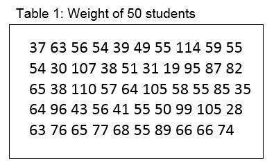
One of the easiest ways of starting to understand the collected data is to create a frequency table. For example, the data below are the weights of 50 students in kilograms.
Just looking at the numbers doesn’t really help us decide, for example, what a typical student weighs. Let us now create a frequency table in which we break weight into 10kg categories, and count how many students fall into each category.
The table below was created using the Stata tab command. The Freq. column is the simple count of how many students are in each weight group. The count describes the shape of the variable, and the table is often called the frequency distribution of the variable. In most health data, the shape of the distribution typically has the highest frequency in the middle, getting smaller as you get further away from the most common values. More of this later.
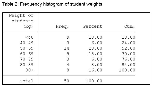
The Percent column is the count as a percentage of the total. The cumulative percent column as its name implies, simply sums up the percentages.
Now simply looking at the table we can say that the most common weight group, or weight group with the highest frequency is 50-59 kg, and 76% of all students in our sample weigh less than 80 kilograms.
The cumulative percent column as its name implies, simply sums up the percentages.
Now simply looking at the table we can say that the most common weight group is 50-59 kg, and 76% of all students in our sample weigh less than 80 kilograms.
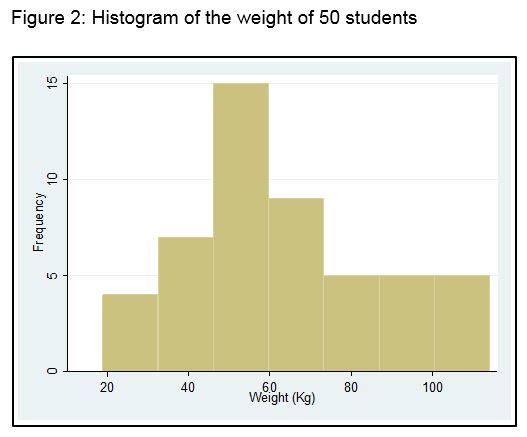
We can also turn the table into a chart called a histogram. Figure 2 shows a frequency histogram of the above data.