14. Basic plotting
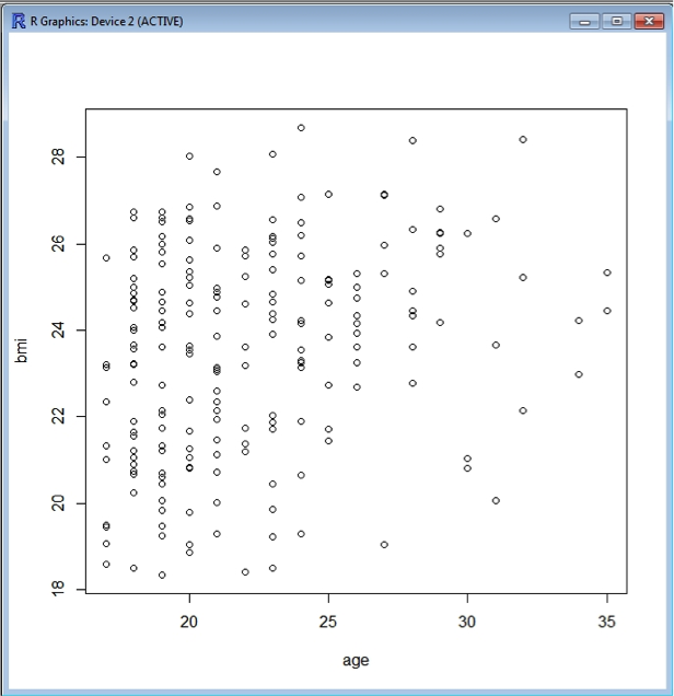
R comes with built-in plotting functionality, and interprets the data to some extent depending upon the nature of the data you are attempting to plot. For example, plotting BMI versus age generates a scatter plot as both variables are numerical.
plot(bmi~age, data=data)
Now you will notice that suddenly a new window opens up containing the plot:
You can colour the symbols as well if you wish, using the argument col=“..”
plot(bmi~age, data=data, col="blue")
To save this plot the following command is used:
dev.copy(png, ' bmi_v_age.png')
dev.off()
Where bmi_v_age.png is the name you wish to give to the picture file. This will save the plot as a “png” file, which is readable by many different software. The file will appear in your working directory.
Similarly, plotting BMI versus gender results in a (fairly meaningless) scatter plot. In contrast, a bar and whiskers plot results from plotting BMI versus genderf , as genderf is a factor this makes for a much more meaningful plot:
plot(bmi~genderf, data=data)
There are many arguments for modifying plots. Here are a few:
horiz=TRUE – rotating a plot
col="lightgreen" – changing the colour of the data
xlab="Gender" – defining the x-axis label
ylab="BMI" - defining the y-axis label
main="BMI by gender" – giving a title to the plot
There are many more option, just type ?plot for help within R. There is also a much more powerful plotting package called ggplot2, which is worth looking into.