10. Create a graph in Excel
In this section, we are going to walk through how to create a graph in Excel using the calculations for sex that you performed in the previous section.
STEPS:
1. In your "Calculations" worksheet, select the entire table with the data you have calculated for sex. Copy this table (either click the "copy" button in the top left hand corner of your "Home" menu, or right-click where you have selected the table and click "copy").
2. Open your "Graph" worksheet, and paste the table you have just copied in an appropriate place (e.g., underneath the main heading for the worksheet).
To paste the table so that it contains the numbers you want, not the formulas, you will need to right-click where you want to paste your table, and select "Paste values" (the option with the picture "123") from the "Paste Options" section.
3. Using your mouse, select the data labels including the title cell for the sex categories (males and females).
4. While those cells are still selected, hold down the ctrl key and select the data range including the title cell for the proportions in each sex category.
5. Making sure the two cell ranges are still selected, click the "Insert" menu at the top of the Excel window, select the "Column" chart type > 2D (first option).
This will automatically insert a column graph (chart) into the "Graph" worksheet.
Charts have several key components that you will need to modify or format:
- chart title
- axis titles
- axis labels
- data points (data series)
- legend
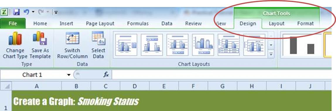
You can find the menus for formatting graphs here:
6. Spend the next 10 minutes or so having a go at changing/modifying each of these chart components on the chart you just created.